


 Low Minimum Order
 Highly Rated
 Quick Turnaround
 No Hidden FeesLow Minimum OrderHighly RatedQuick TurnaroundNo Hidden FeesLow Minimum OrderHighly RatedQuick TurnaroundNo Hidden FeesLow Minimum OrderHighly RatedQuick TurnaroundNo Hidden FeesLow Minimum OrderHighly RatedQuick TurnaroundNo Hidden Fees
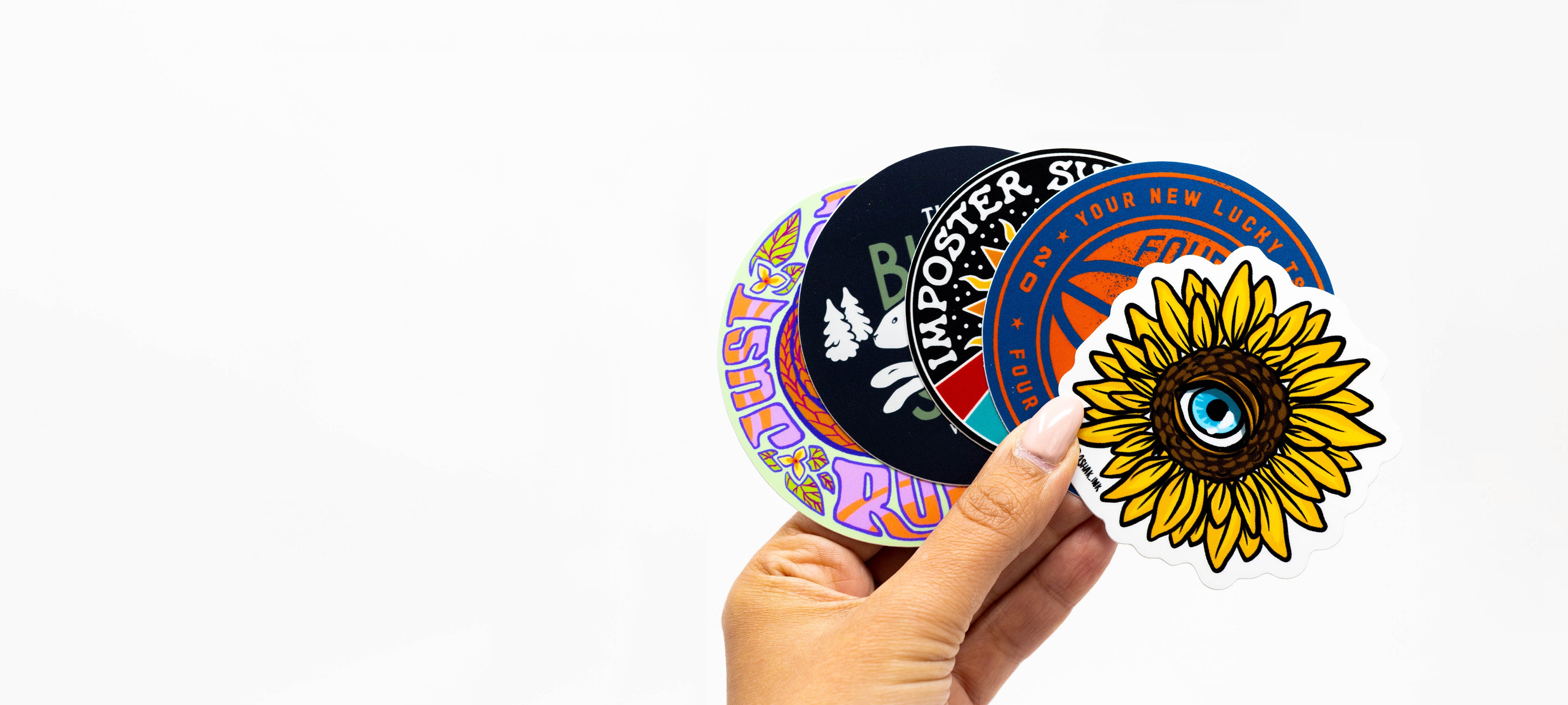
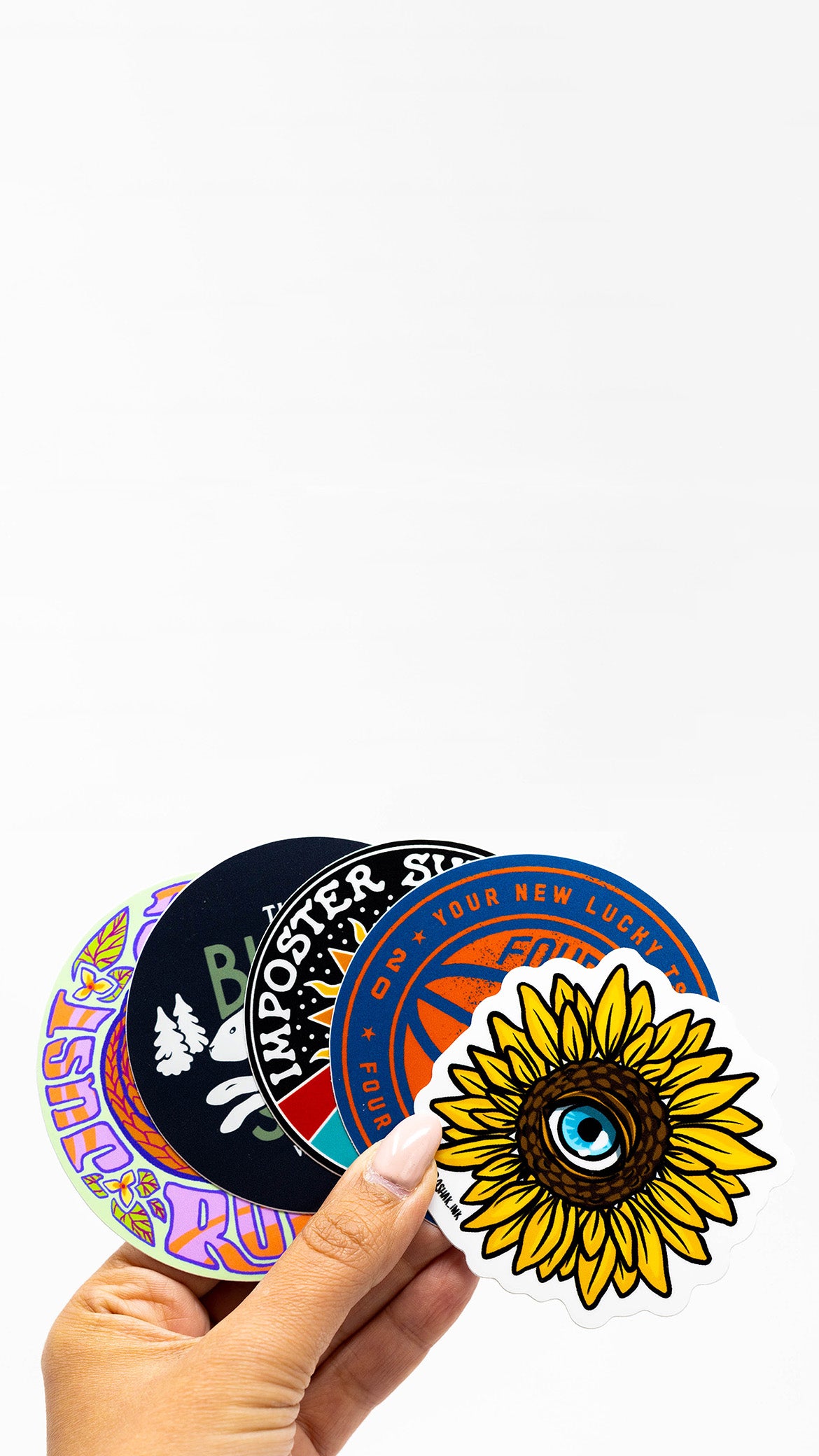
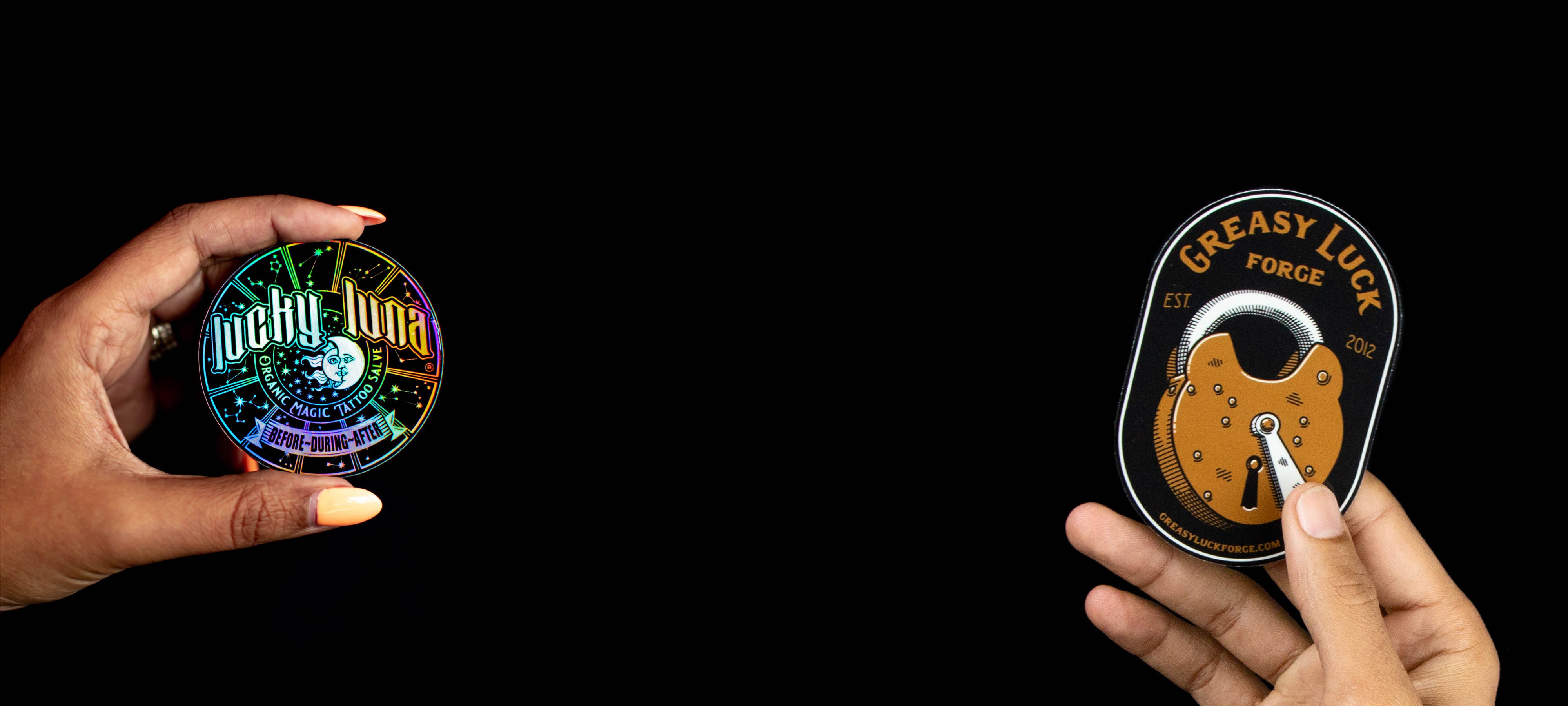
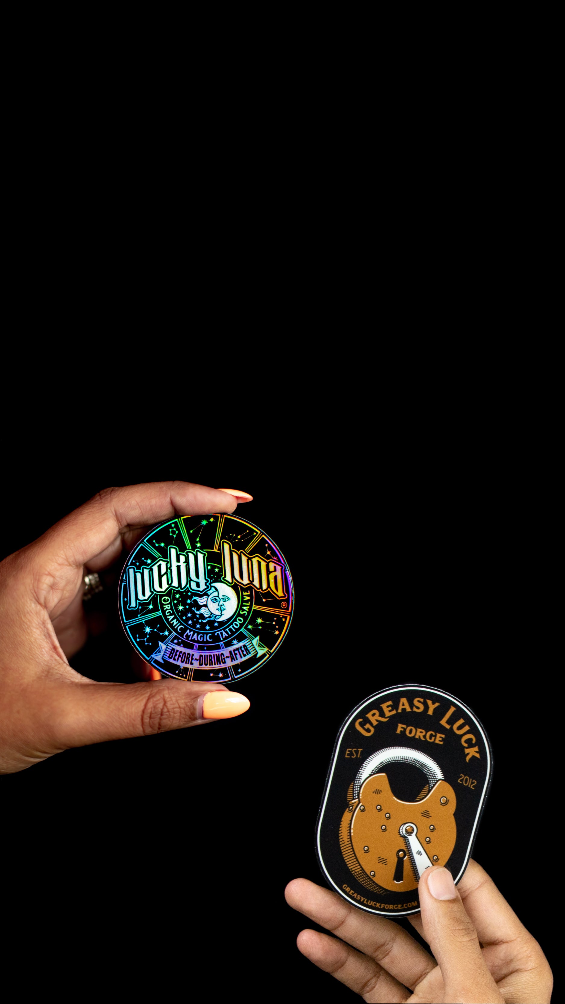
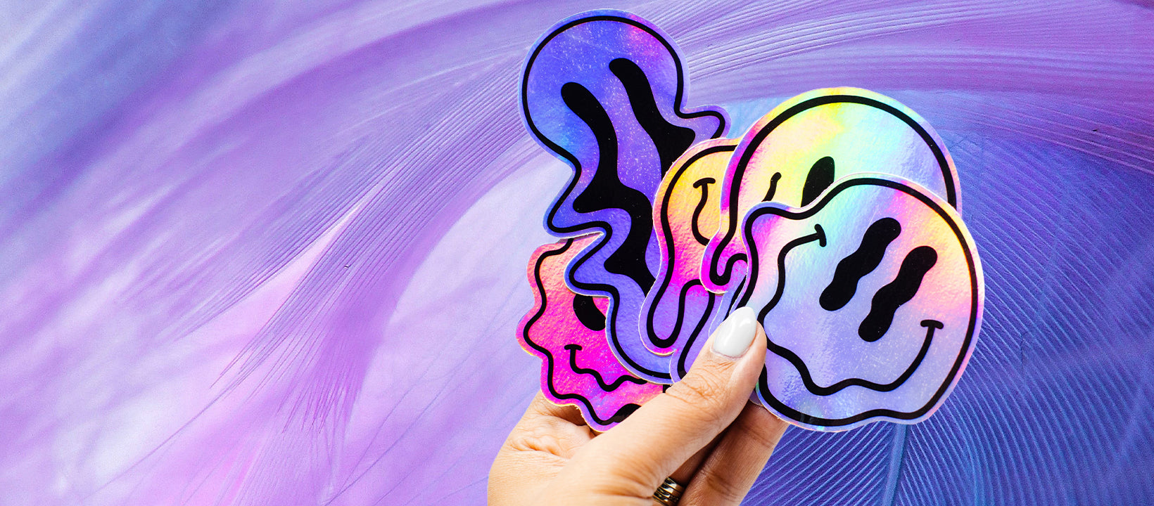
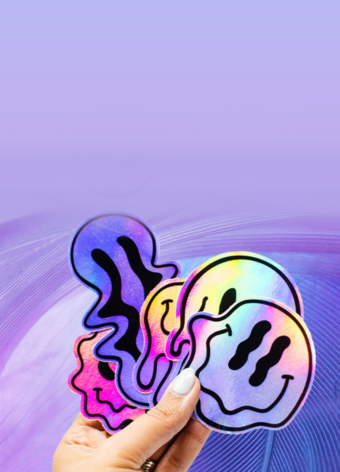
Stickers cut to the shape of your design
Premium quality stickers are the fastest and easiest way to promote your business, product, brand, or event.
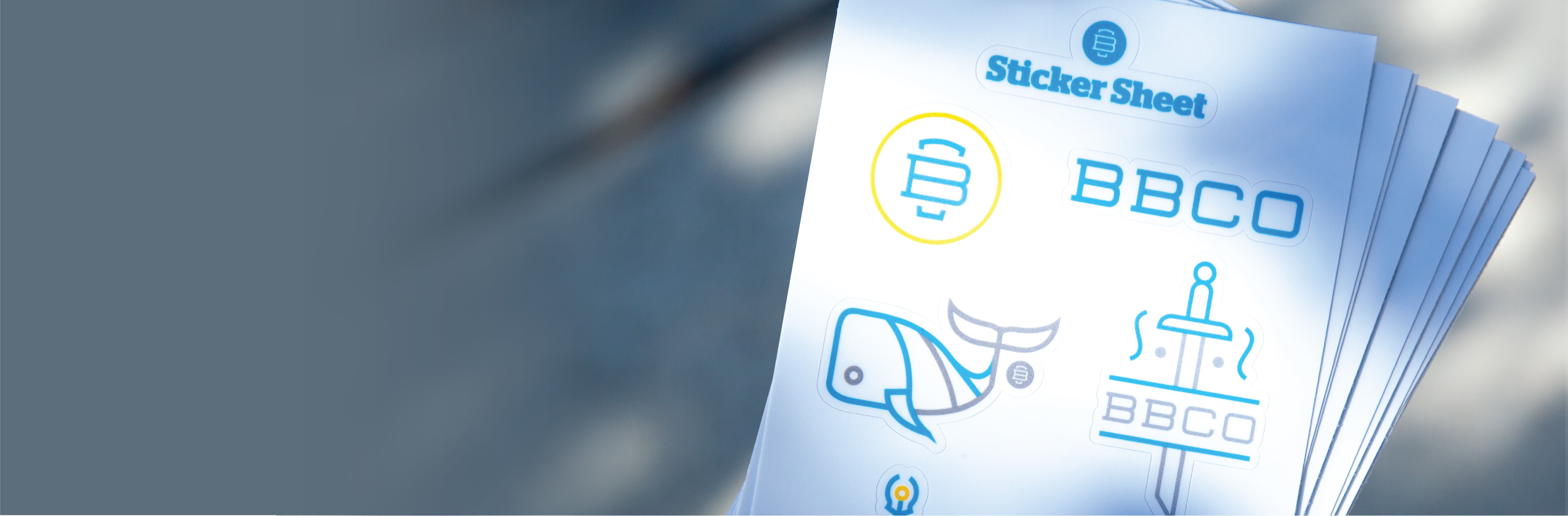
Brands That Trust Us


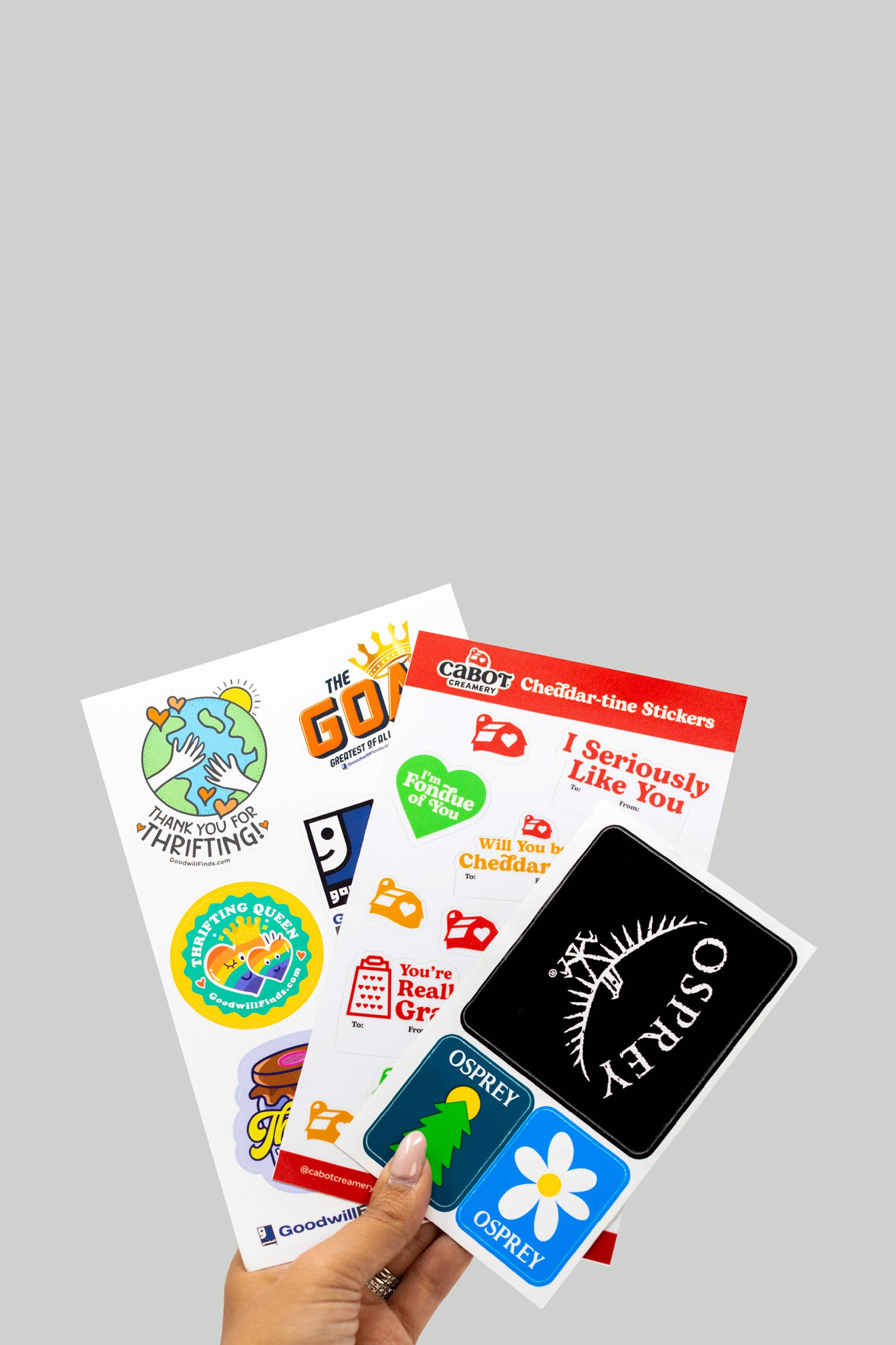
Our best selling Custom stickers

Printed to last


UV protective laminate
Prevents your sticker from fading

Vibrant Colors
Printed with Certified Eco-Solvent ink

Bombproof Sticker
Long lasting outdoor durability keeps your sticker looking great for many years. Easy to remove when you are ready for a new one

Weatherproof Adhesive
Your stickers will stick on your snowboard, skis, surfboard or anything else that gets wet-even on your water bottle after you run it through the dishwasher

Recycled Backing Paper
Easy to peel, silicone coated recyclable backing paper


